THE MONOTONOUS LANDSCAPE OF LUXURY BRANDS' LOGOTYPES
VALIA LIU
2022.2
WEB TYPE
AFTERMATH
INDEX
VALIA LIU | 2022.2
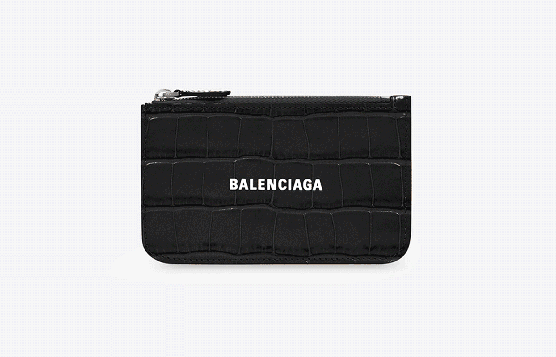
THE WALLETS / CARD HOLDERS RELEASED BY MULTIPLE LUXURY BRANDS THAT SHARE SIMILAR DESIGN FEATURES.
In the last couple of years, there is a sudden trend of a modern-style rebranding among plenty of luxury brands, leading to a visual convergence between truly diverse brands like Burberry and Balenciaga. There are mainly two approaches to rebranding: first, the simplification of the brand’s name; second, the redesign of the logo.
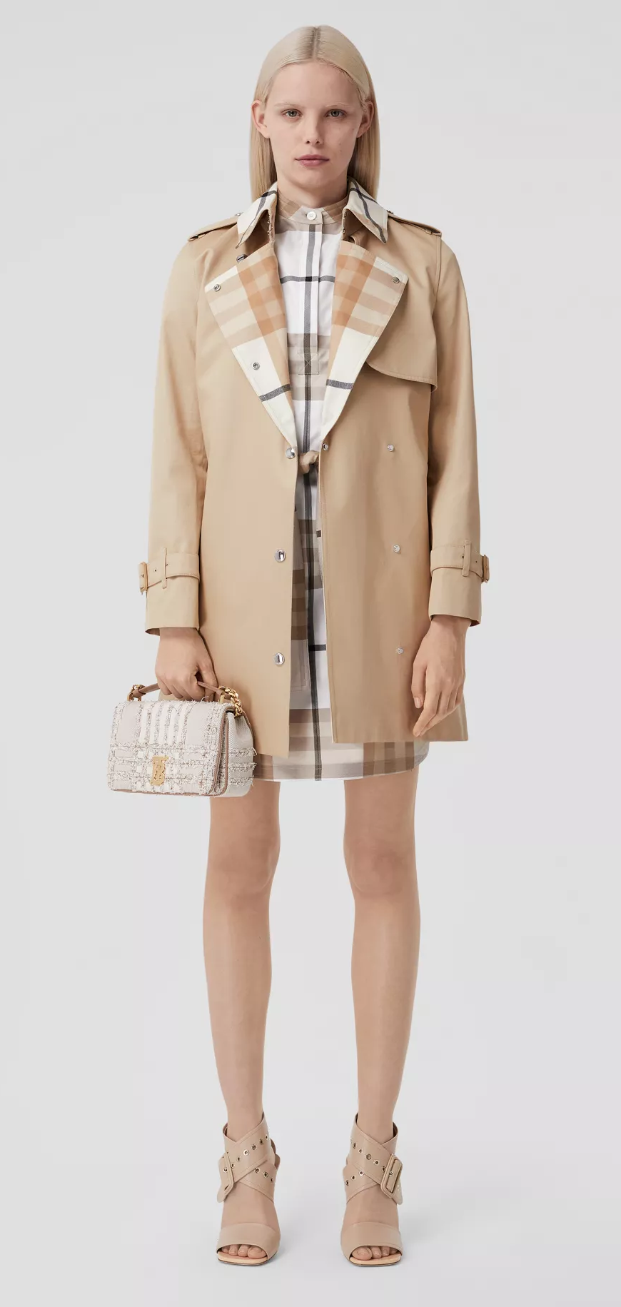
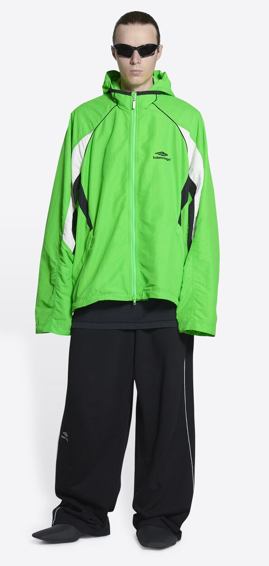
PRODUCTS FROM BURBERRY (LEFT) AND BALENCIAGA (RIGHT).
For instance, the French luxury house Celine abandoned the accent on the “e” and tightened the space between each letter. According to the brand, the move was made to have a “simplified and more balanced proportion.” For Celine, the move can be seen as a step closer to the English-speaking mass market, however, for some of the other brands, further simplifications were made. In 2012, Hedi Slimane, a French fashion designer, dropped the “Yves” from Yves Saint Laurent. Nevertheless, in 2014, John Galliano, a British fashion designer, dumped the “Martin” in Maison Martin Margiela.
In addition, plenty of brands adopted a black and white, sans-serif, and minimal logo. Among them, Burberry is probably the one that is being discussed the most because the new modern logo does not seem to fit the brand’s history and style at all. As a European national brand that is famous for its classic patterns, the huge contrast of its logo made people curious about the motivates behind the rebranding.
"FASHION’S BRANDING CLEAN SLATE IS AS MUCH ABOUT ERASING THE PAST AS IT IS ABOUT SECURING THE FUTURE, ARGUES JOHN WHELAN."
Those actions can not be coincidences. There are definitely shared reasons behind the uniformity of the rebrands.
First, according to Riccardo Tisci, the sans-serif types have the feature of “modern utility”. By that, he means it can make the logo looks cleaner, more legible, and more flexible in case of design on multiple mediums. This not only enables the brand to adapt to the shifting fashion trend quickly but also has a performance on web pages, which are the main information sources nowadays. Mitch Goldstein said: “the specificity of these logotypes means that they can mean whatever the brand wants, whenever the brand wants it, wherever the brand needs to be.”
Second, this shift states that the luxury brands are trying to move on from their past. By simplifying the brand's name, the influence of the label’s founder is diluted. This creates more space for the new designers to develop without being trapped by certain rules and styles. Moreover, without any doubt, the modern logo would be more suitable for the “commercial realities of the 21st Century”, which can increase the customer base.
Meanwhile, we experienced from the past that was “a closed, undemocratic place where very few were able to create their own destiny.” Under the outer environment that is really sensitive to racial and cultural problems, the luxury brands need to state their side clear to fulfill the expectation of their consumers. That's why they chose the erase the logos that are connected with the inequalities in the past–to shape a better image for the present and future.
In the case of Burberry, it cuts the typographic styling that has classic British characteristics. As a result, it added “London, England” on the lower part to show its origin. Instead of letting the logo itself speak, the brand chose to provide more written information, which seems to be against the principles of design.
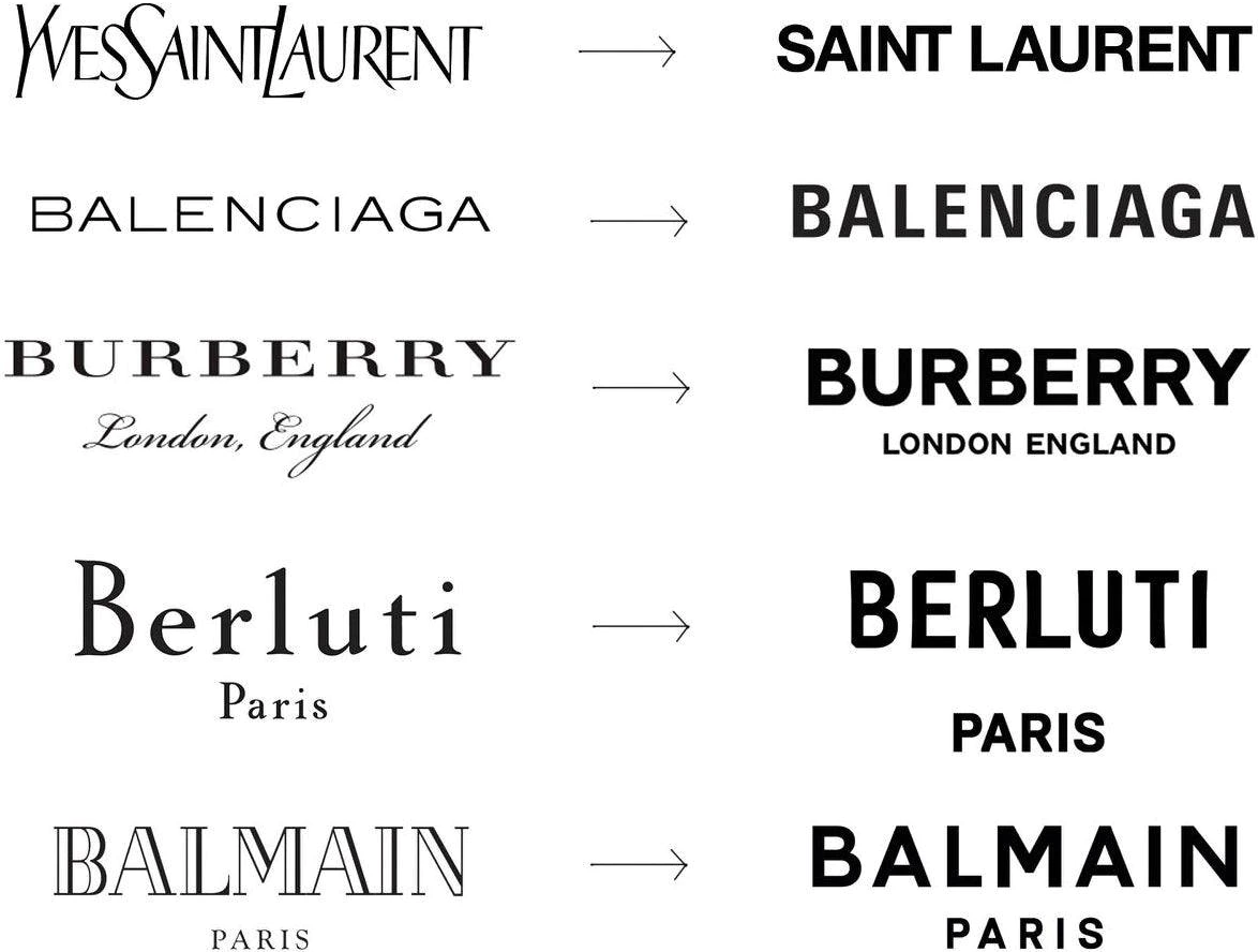
HOW DIFFERENT LUXURY BRANDS’ LOGO CHANGED IN THE PAST FEW YEARS.
"FOR A GLOBAL CREATIVE INDUSTRY, HOMOGENEITY IS DANGEROUS."
Just like a coin, everything have two sides. It's true that the brands are enjoying the benefits of the more modern design: it will be much easier for them to release more trending simple designs, like the “Premium Mediocres”, so that they can boost their customer base. However, it’s also true that once they start this kind of shift, there will never be an end. To be more trendy, in other words, to make more money, the future designers may shift the logo again and again. This not only would make the trace of the former designers more invisiable but also would lead to an unstable brand image.
After all, there might be enough reasons for the brands to make the decision of rebranding, but we shall never forget that fashion houses are within a creative industry. When they are trying to claim their statements of equity and diversity in racial wise, what they are actually creating is another homogenization. If the cost of stating their attitude toward social justice is their individuality, is it really worth it? Take Burberry as an example, a lot of people are commenting on how the new logo cannot express the brand’s feature in any kind. So is the amount of modernness that the brand gain even balance to the lost of its identity?
As there are more and more new raising brands that is more bold, fashionable, and free, what's the true advantages of these luxury brands?Without having their own features, how would the future competition of the fashion market be? This trend truly left us a lot of questions to think about.
Op-Ed | The Revolution Will Not Be Serifised: Why Every Luxury Brand’s Logo Looks the Same
Why Do All New Fashion Logos Look the Same?
VISUAL REFERENCE: